Posts

Showing posts from 2016

Altered Mixed media frame

Image
Greetings!!! I would like to share my new experiment with altering old frames.I pulled out some of the very old products from my stash, plus a few from here and there. I was trying to find inspiration since many days and finally I found one. I have added some wooden embellishments too. I did not have black gesso, so i added black acrylic with Camel texture white and then gave my frame couple of coats. Here are some pictures of the frame before i started painting. When it dried, I added Fevicryl colurs - Pearl Gold, Green and some blue shades. Here are some pictures of final layout. Thank you so much for stopping by :)

Steampunk Mixed media journal cover

Image
Hi all, Sharing my recently created steampunk themed mixed media cover. Thank you for stopping by..

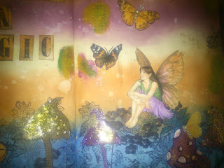
Art Journal - Believe in magic!

Image
Good morning!! Sharing another art journal layout here. I had lot of fun while making it. Here are some closeup pictures. Thank you so much for stopping by

Art Journal - So many Books, So little time

Image
Hi all, a very good morning Today I am sharing another art journal layout inspired by Vicky's  Art journal page: Reading . I loved the way she made a stack of books using card stock and distress inks. I chose different quote for art journal and accordingly made changes in elements. I decided to add clock in background. I stamped clock numbers on white cardstock using Ranger archival ink and then coloured it with Artistry ink - Blue Moon I made clock hands from white card stock and coloured them with Artistry ink - dark Umber. It was fun. To add more fun to this page I added wooden owl sitting on the top of book stack. Sharing some more pictures of final layout. Thank you for stopping by :)

Art Journal - Create Imagine Inspire

Image
Hello everyone, Sharing another art journal layout with you all. This art journal is inspired from  Vicky's Style art journal . I enjoyed watching her how-to video. Loved the colors and elements she used in this page.  For this page she has added a zipper to make even more interesting. This was more than enough for me to get started. I started collecting stuff to start with. I got this old zipper resting in my stash. I colored it with Pearl metalic acrylic color to make it more interesting. The zipper was originally Blue. Anyway I prepared my background by first covering all of it in diluted texture paste. Then I added Fabrica's Golden turmeric colour to whole layout with wet tissue papers. Then I used Tim Holtz Burlap stencil all over the page with my texture paste. I added some more Golden turmeric and dark brown color to make it look like old burlap piece.. But needless to say i totally failed :D I tried fitting zipper. But I could not make it wor

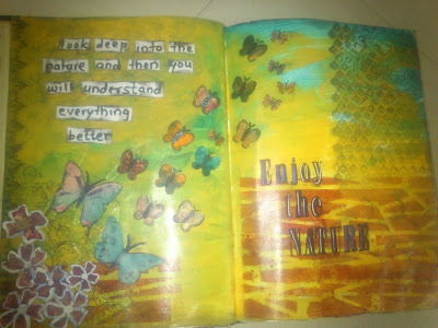
Art Journal - Enjoy the Nature

Image

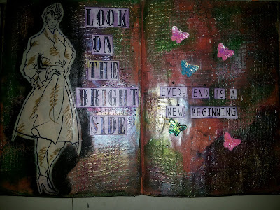
Art Journal - Look on the Bright Side

Image

Art Journal - World Travel

Image

Art Journal - Life is Beautiful

Image

Art Journal - Window

Image

Birthday cards

Image
Good day to all! Got my first set of tim holtz blueprint stamps. I just could not wait any longer to use them. Made two birthday cards.Here are those. First one is shaker card. I stamped gift stamp for 4 times using masking technique and created pile of gifts to show on the left side of the card and stamped birthday cake on a different piece of paper. I colored all stamped images and fuzzy cut them.            Second card is made with layering birthday cake images. I stamped birthday cake image thrice and then layered images using foam tape. I have not stamped sentiment on second card yet, since I may use it for some other occasion. For background i have used Tim Holtz burlap stencil and Artistry's Dark wine ink. I tried to make my birthday cake look vibrant, so that it pops out well from the background. Well its always fun to experiment with stamps and stencils. Guess that this is just a beginning. And I am loving it. Thanks so much for stopping by.